Widget appearance
Use Project Settings → Widget → Appearance to match the reporting experience to your product. The live preview shows draft changes; select Save changes to publish them. Appearance does not change the destination project.
The page is a strip of groups: Launcher, Dialog, Questions, Colours, Branding, and Match my site. A seventh group, Quick capture, appears only while team mode is on.
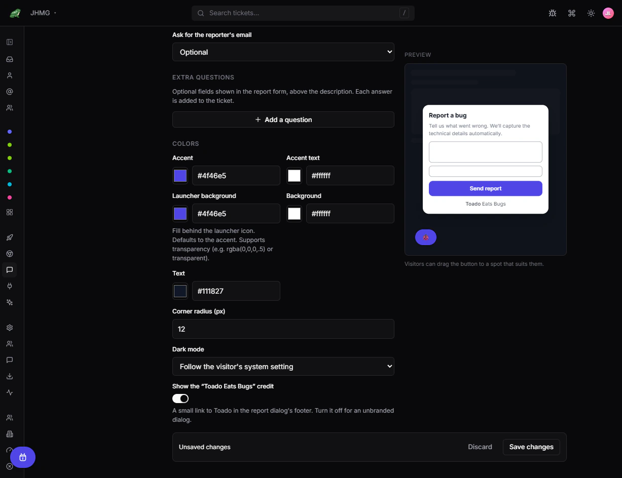
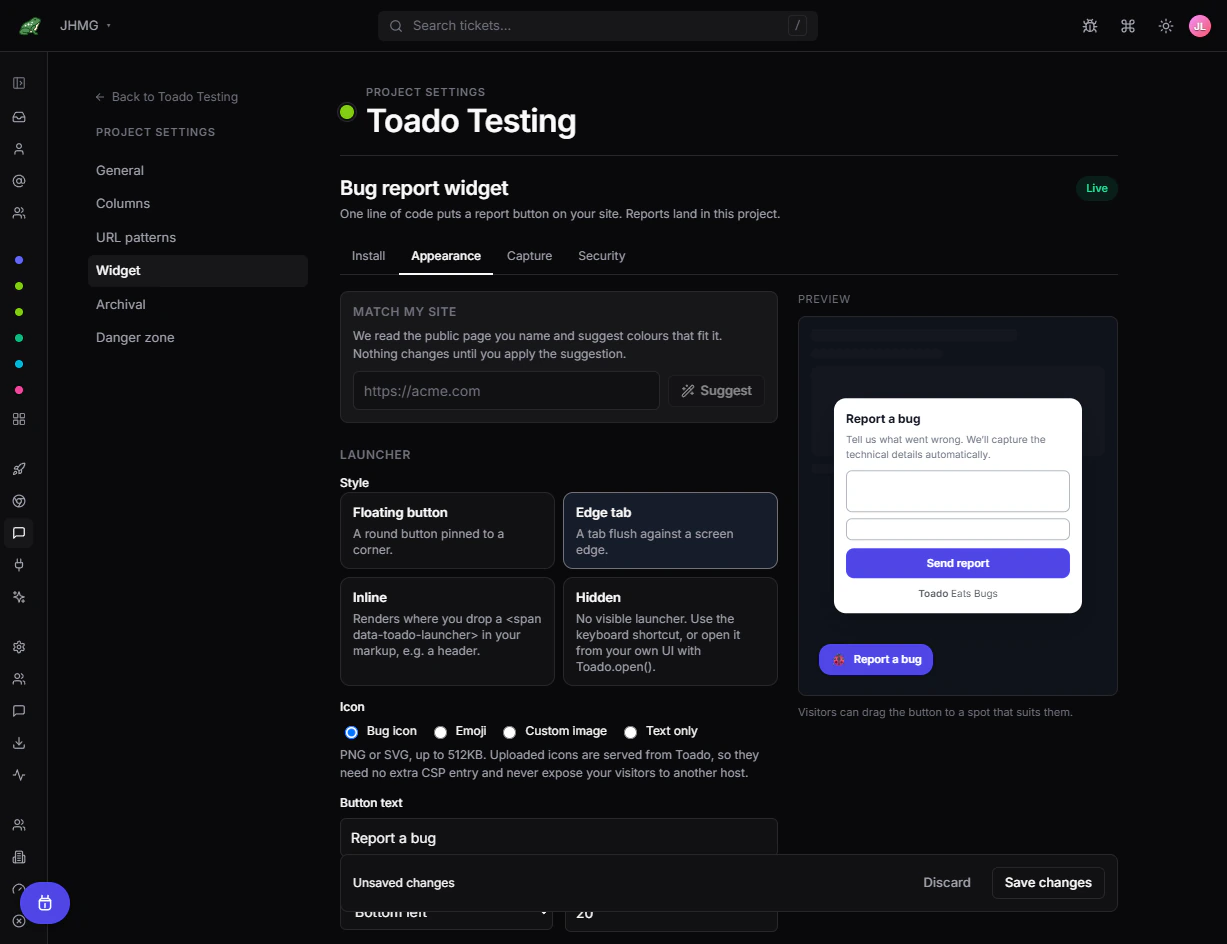
Choose a launcher
| Style | Use it when | Behavior |
|---|---|---|
| Floating button | You want an always-available action | Floats at the configured edge and height. |
| Edge tab | Space is tight or a persistent label helps | Sits compactly against the selected edge. |
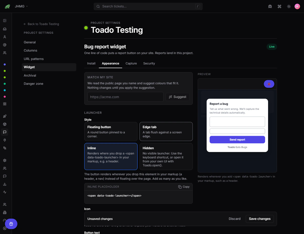
| Inline | The action belongs in your header, menu, or help area | Renders inside a markup placeholder. |
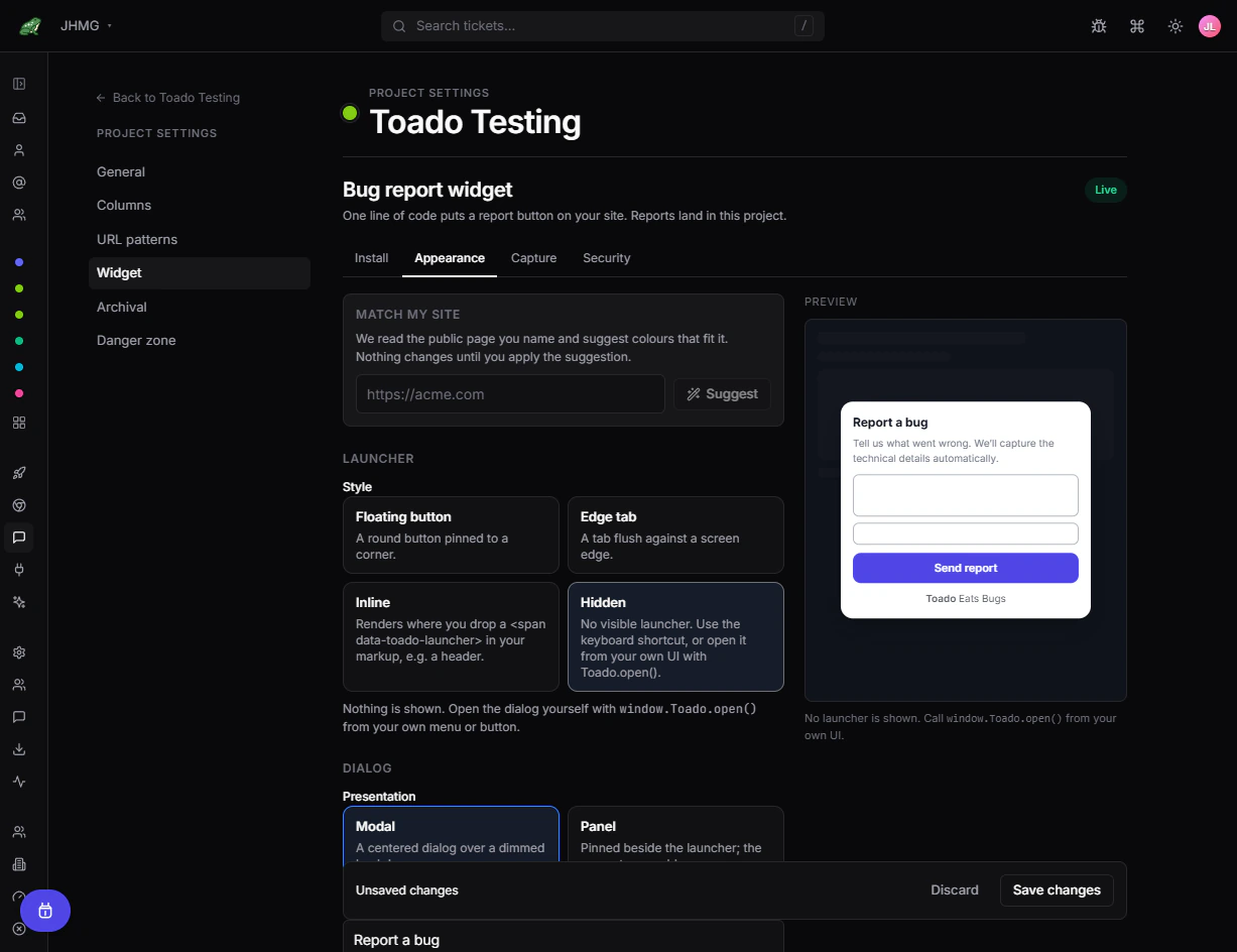
| Hidden | Your product already has a feedback action | Shows no Toado launcher; your UI opens the dialog. |
Floating button
Edge tab
Inline launcher
Install the script, choose Inline, and add this where the button should render:
<span data-toado-launcher></span>Toado adds its own child without replacing existing host content. You can use multiple placeholders on one page.
Hidden launcher
Choose Hidden, then connect your own button to the supported public method:
window.Toado.open();Load the Toado script before invoking it. The loader queues calls the page makes before the bundle arrives, so an early click is replayed rather than lost.
window.Toado is the widget’s public surface, and it carries nine methods:
| Method | What it does |
|---|---|
open() | Opens the report dialog. |
close() | Closes it. |
capture() | The same as open(). There is no headless capture: a report needs a description. |
identify(user) | Attaches a known reporter’s email and name. See Widget capture. |
setTheme(theme) | Overrides the saved theme for this page load. |
mount(element) | Renders an inline launcher into an element, the programmatic form of the placeholder. |
unmount(element) | Removes one. |
ready() | Resolves once the widget has booted and rendered. |
destroy() | Removes the widget and every listener it installed, for single-page apps that unmount integrations on sign-out or navigation. |
The loader queues open, close, capture, identify, setTheme, mount, and unmount. It does not queue ready() or destroy(), so call those after the bundle has booted.
Position, dragging, and mobile
Start position offers the six combinations of top, middle, or bottom with left or right. Distance from edge (px) takes 0 to 400. Visitors can drag it lets a visitor move the launcher, and Toado keeps that position on their device as they move between pages; changing the start position or the edge distance resets every saved position back to your default.
Stacking priority decides what the launcher sits above: Below site overlays, Above modals, below critical overlays (the default), or Always on top.
Position, edge distance, dragging, and stacking apply to the floating button and the edge tab only. Inline and Hidden launchers do not use them. Show on mobile applies to any visible launcher at narrow widths.
Icon and label
The Icon picker offers four choices: Bug icon, Emoji, Custom image, and Text only. A custom image is a PNG or SVG of up to 512KB, uploaded immediately rather than staged with the rest of your edits, and Toado serves it from its own origin, so it needs no extra CSP entry and exposes your visitors to no other host. Button text takes up to 60 characters; keep it short and action-oriented.
- Give icon-only controls an understandable accessible label.
- Keep the default touch-target size or larger.
- Check contrast in light and dark modes.
- Avoid cookie controls, chat buttons, checkout actions, and mobile navigation.
Dialog and theme
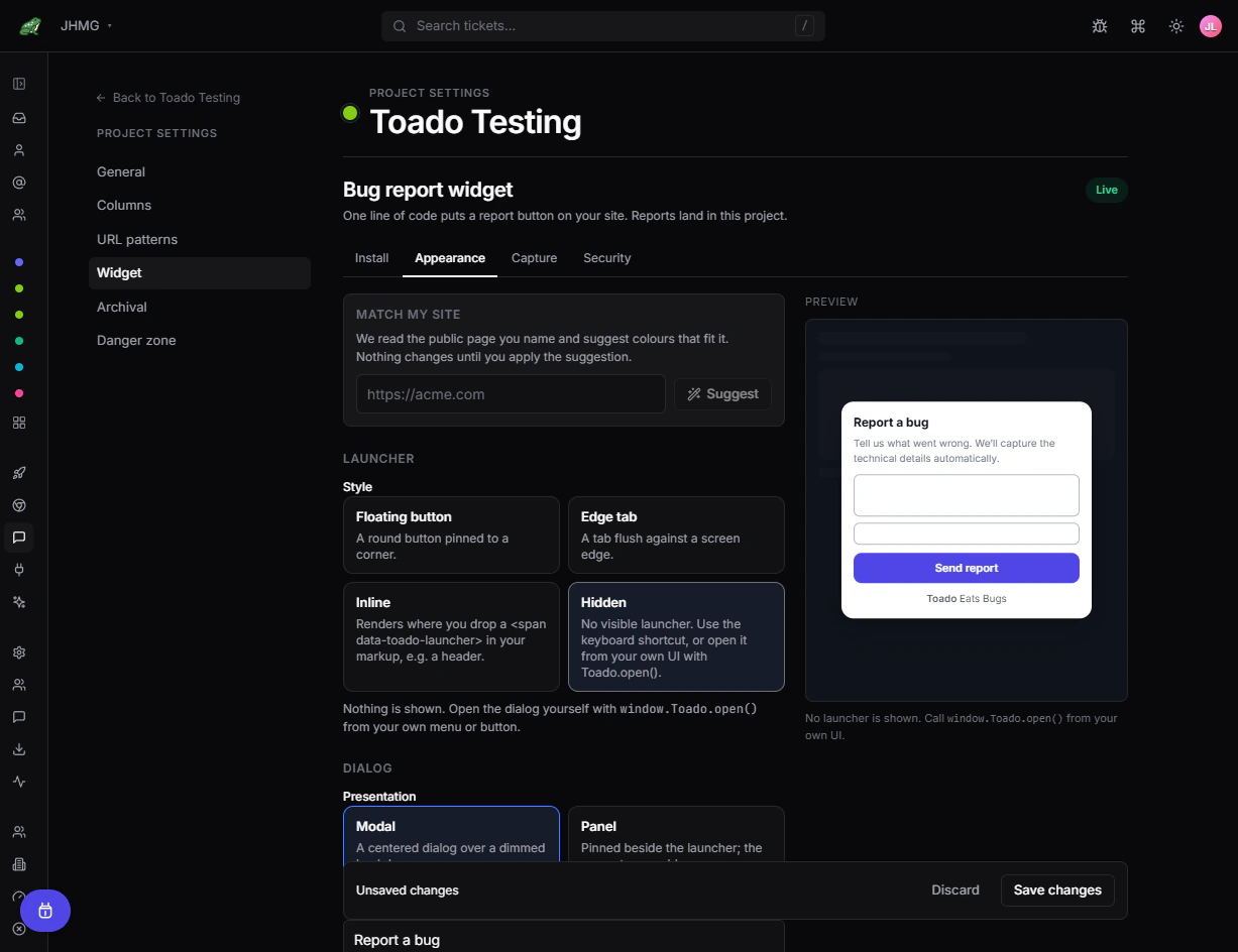
Modal centers the form. Panel pins it beside the launcher so more page context remains visible. Test both on narrow screens and pages with fixed overlays.
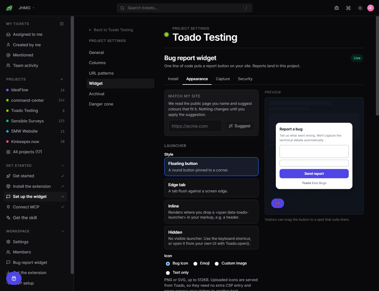
Colours sets Accent, Accent text, Launcher background, Background, Text, Corner radius (px) from 0 to 32, and Dark mode (Follow the visitor’s system setting, Always light, or Always dark). Hex values get a native swatch; rgb(), hsl(), named colours, and transparent values are accepted as typed.
Match my site reads a public page you name and suggests colours from it. Enter the URL, select Suggest, then Apply these colours to stage the proposal. Nothing changes until you apply it and save, and generation is capped at five runs per project per day. Review contrast, focus states, readability, and dark mode before saving. It is available to every workspace; there is no separate entitlement.
Dialog sets the presentation and the wording the reporter sees: Title (up to 80 characters), Intro text (up to 240), and Ask for the reporter’s email (Optional, Required, or Do not ask). The submit button and the confirmation message are not editable in Widget Studio; they read “Send report” and “Thanks, your report is on its way.”
Branding carries one switch, Show the “Toado Eats Bugs” credit, which turns off the small Toado link in the dialog footer for an unbranded form.
Questions
Questions adds fields above the description, and each answer is added to the ticket. A project can have up to eight. Each takes a label of up to 60 characters, a Required checkbox, and one of four types: Short text, Long text, Email, or Dropdown. A dropdown needs at least one option and accepts up to twenty, each up to 60 characters; one with no options is refused on save. Answers are stored up to 500 characters each. Ask only for what changes triage.
Team-mode quick capture
Turning on Team mode (on the Capture page) adds a Quick capture group here. When the launcher is clicked chooses between Open the report form and Capture and open in Toado, and the same control is mirrored on the Install page under the on switch. Capture shortcut offers Off, Alt + Shift + B, Alt + Shift + C, and Ctrl + Shift + B; pressing the combination anywhere on the site captures the page and opens it in Toado, and it stays inert while the visitor is typing in a field.
Both paths skip the report form, so they are meant for your own signed-in Toado users. See Widget capture.
Where to next
- Bug report widget, install and quickstart.
- Widget capture, what each capture level collects.
- Widget security, allowed sites, CSP, and keys.
- Widget troubleshooting, when the launcher or a report does not arrive.